Monday, August 25, 2014

New Painting Just in Time for Autumn

I’m calling this one, End of Season Sail.
I made a color sketch of the scene last fall and didn’t get around to the larger painting ’til just now. The marsh in Essex looks very flat green in the summer. I was attracted to the blue-green-gray tint that the tall grass takes on, showing the high water line. And when the weather turns colder, the grasses change to different colors and at different rates, breaking the plane up into pieces.

It’s great how a deadline can kick you in the ass. I needed something to go in Show #5 at North Shore Arts Association, so I painted in overdrive last week (and even yesterday, the day I dropped it off). So, this really is a fresh one. I just hope it doesn't stick to the frame. Mmmm, there’s nothing like the smell of drying linseed oil in the morning.

Saturday, October 5, 2013

Painting Progress: Finished?

I may have a few tweaks (and a signature) to make to this painting when it has dried a bit, but I think it’s done. I managed to get both birds in the image without it looking goofy. The immature little blue heron is under the willow, looking like he's wondering if the great egret is willing to share the pond. If you look closely you can see that he sports a little patch of dark feathers.
I left out a couple rocks (among other things) that were in my reference photos. There were just too many bright objects on the shore and I needed to give the egret some space. Now, I like the way the line of rocks says, "Rock, rock, rock, bird! See, an artist can improve on reality!
Note: as you might imagine, the painting looks 10 times better than this photo can show. I’m rather proud of the shade area to the left of the path. In the original it's alive with muted flowers. There’s a lot to explore in this canvas. I hope you like it.

Friday, September 13, 2013

North Shore Arts Association


After several tries I have been juried into the North Shore Arts Association in Gloucester. It’s an honor for me, being a north shore boy, born and bred. My parents grew up in Essex and my grandparents lived there until their deaths, so the artists of the association were all around us. My mother’s parents had a large painting by Howard Curtis (a long-time NSAA member) hanging on their wall as far back as I can remember. Howard taught art at Gloucester High School and was a good friend of my grandfather's, who also taught there. The seascape above was a house-warming gift to them back in the 40s. I have to think that subliminally the painting inspired a young Stevie Simpson to be interested in art. I'm sure I pondered the wonderful grays of the foggy scene while eating Thanksgiving dinner in their living room or resting in the cool of their (1) giant air conditioner after helping them pick blueberries in August.

I went to college at Salem State University and the kind of art that was produced and encouraged by the NSAA was sneered at (a little) by the academics who taught me there. Modern art was the driving force in the 70s and realist landscape paintings weren't the coolest thing to be making as the time. Fortunately, most of the professors themselves were making realist art (with a twist) in their own studios so I received a great foundation in drawing and painting.

In a way I feel like I'm coming home again. I did my art experimentation (among other things, ha, ha!) in college and came back to the realist landscape anyway. It feels good to be home. 

Thursday, August 29, 2013

Painting Progress

I'm working on a painting of a farm on Cape Ann this summer. I photographed the view I like and frankenteined the design I want in Photoshop. I plan to give lots of play to the reflections on the surface of the pond — there are just so many wonderful mauves in there.


 Above is my initial lay-in painted on location. I'm just getting a feel for big areas of value and color and firming up the overall design here.

My second pass, this time in my studio. Firming up the major players.

My third session with the canvas is again in-studio. Normally I move all around the canvas, but this time I am bringing the house and the background line of trees along first because they will all be reflected by the pond. I hope my next session is on location again. I think it's time. Later. —SAS


Friday, March 30, 2012

Nature is a Start


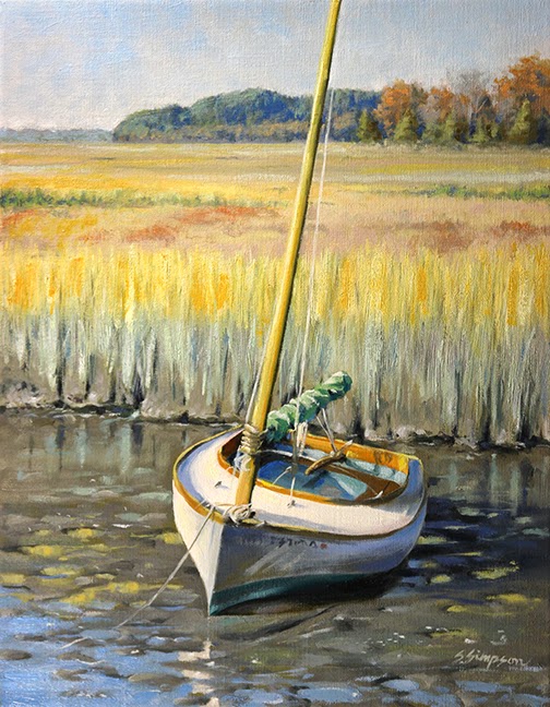
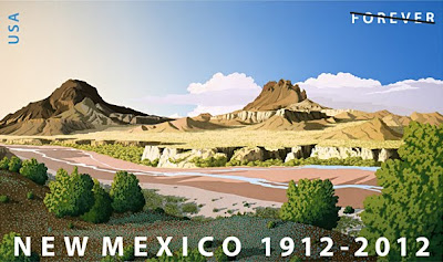
I was standing in line at the post office the other day and was checking out the new stamps in the case on the wall. I've been to the desert southwest several times and I love the area, so a new stamp of the New Mexico desert caught my eye. I thought I might buy one and frame it as a mini art object. I get these odd ideas sometimes.
Well, the woman ahead of me in line was taking forever, so I had lots of time to study this stamp. My painters eye switched on and I started picking apart the composition. I apologize to the artist because it's really a beautiful stamp and criticism is cheap and it's kinda shitty for one artist to pick another's work apart, but I can't help myself!
I'm prone to copying nature too religiously. I know this about myself. I have to force myself when painting to think, "How can I improve on this view of Nature?" Some may think that nature is so wonderful and awe-inspiring, who am I to change what I see when I craft a painting of it? We must remember that art is a totally man-made thing. Nature doesn't try to look beautiful, we decide that a certain view is beautiful and record it in a way that pleases us. One thing that I make a conscious effort to keep from my paintings is repetition. When two objects are the same size in an image, our brains, which are constantly looking for patterns and similarities, latches on to this and gives it significance. Nature is random, so, a painting of nature that presents repetition that is exact makes the painting look, um, unnatural.
This stamp shows two buttes. The one on the left is obviously farther away than the one on the right. But, in the original stamp the butte on the right is almost exactly the same size. To make matters more difficult, the bush at lower right is also the same size as the buttes! Now, this scene may be accurate to what you would see if you stood in that spot, but, why would you choose to represent this? Since I can't help myself (and I know a good deal of Photoshop) I have edited this image to demonstrate how I hope I would have interpreted this scene if I were to paint on this spot in the desert.

Original:

Edited:
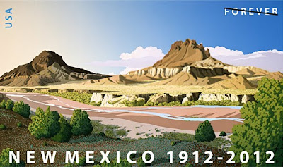
Here, I have enlarged the closest butte and pushed its head up through the clouds behind. This dramatically improves the perspective of the scene. It's really important because the foremost butte is lighter than the farther one. Colors are generally darker and more saturated the closer you are to them. I've shrunk the shrub at lower right to subordinate it to the buttes and prevent it from competing with the buttes scale-wise..
I don't want to take away anything from the artist. I love this image, and it could be that he represents the scene accurately. But, if the aim is to make a pleasing picture (using one's artistic license) then you should be conscious of these relationships in your work and actively seek to make better paintings by mitigating them. Otherwise, you might as well become a photographer.

Tuesday, March 27, 2012

The Wrong Side of the Tracks?

I've finished my painting of the railroad bridge over the Charles River in Boston (18"X24" on stretched linen) and I'm pretty happy with how it turned out. I was attempting to set up several themes and I think I succeeded:
1) Triangles in the landscape.
2) Ideas of ugliness and beauty.
3) Text in the landscape, both acceptable and, um, not-completely-acceptable.
4) Art imitating life imitating art, etc.
5) Hard vs soft areas in landscape (and strong contrasts).
The triangle theme is obvious. I'm attracted to strong geometries in the landscape. I always liked geometry in high school, so I guess my mind naturally keys in to that.
The ugliness/beauty theme is rather subjective. Street art is all the rage nowadays (at least with the critics). I like juxtaposing the rather cliché prettiness of sailboats with the edge-of-repectability in grafitti. To be fair, there was a lot more grafitti on the bridge than I included in the painting. The bridge already has a very strong personality, it didn't need any more.
The text in the landscape (bridge and sail) theme is obvious.
In the art imitating life... theme I chose to make art of a real-life scene that includes grafitti (the "Obey" face by Shepard Fairey, patially visible at left) that was created from another's photograph of a real living person (André the Giant). It feels a bit like looking into a mirror reflecting a mirror, then again, and again...
I made many little decisions in bringing this painting to finish from the last posting of it. I minimized the buildings on the left in the distance to keep them from contradicting the perspective of the image. I am still concerned with the 2 tree-covered peninsulas that are in that area. The bigger one is behind the smaller one — that is contrary to perspective, but I think I will live with it. I made sure that the more distant foliage is significantly cooler in color temp to push it back. I kept the sailboats soft (other than the large one) to add to the contrast with the iron-hard bridge. Next up, NOT a bridge!

Monday, March 5, 2012

What’s on My Easel

I’ve started a 16” x 20” canvas of my BU Bridge field study from last summer. What drew me to this view was how the airy, cool, and idyllic river with sailboats was framed by the hard, contrasty, warm tones of the rusting, grafitti-covered railroad bridge, and how the battle between the two played out in the reflections in the water. I gravitate to such contrasty images (you won’t find me doing too many fog paintings), but maybe they’re not to everyone’s taste.


I visited the location in Boston twice last year to get the palette recorded in my 8” x 10”study. I had a good deal of pruning to do of the trees and shrubs at the river’s edge to get even a semi-unobstructed view (don’t tell anybody it was me). I always pack a pair of loppers in my car for the occasional branch that’s in the way, but this area needed a lot of work! I don’t know what the people riding and running by thought I was doing, but at least one shouted, “Thank you.” I think she thought I was making it easier for bikers to see around the curve.

I took many reference photos of the water, the bridge, sailboats, grafitti from both sides, and the city in the distance. While I paint in my studio I display these on my computer as needed. The plan is to sift through my pics of grafitti and include a nice array of ones I think go together. This will set up a secondary juxtaposition in this painting: fine art (I hope) played against street art. I don’t think any of the street artists will sue me or anything, since they’d have to admit in court to breaking the law in placing their grafitto on the bridge in the first place, ha! Here is an interesting question: If I include a bit of Sheopard Fairey’s “OBEY” sticker that still shows on the bridge, can he sue me because he has paid his fines for doing it? Hmmm. I think it falls under the heading of “Fair use.”

Since the reflections in the water are dependent on the landscape I plan to do the water last (I have just roughed in the colors here). I started the bridge with a wash of cadmium orange so that the overall effect will be warm. You can see that I have lightly outlined where I am going to place the closest sailboat. This boat is going to appear dazzlingly bright compared the massively dark bridge, so this will be my focal point. I will include at least a few more distant boats to create depth in the scene.

I guess a third theme in this painting would be — triangles!

More top come!