Friday, March 30, 2012

Nature is a Start


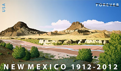
I was standing in line at the post office the other day and was checking out the new stamps in the case on the wall. I've been to the desert southwest several times and I love the area, so a new stamp of the New Mexico desert caught my eye. I thought I might buy one and frame it as a mini art object. I get these odd ideas sometimes.
Well, the woman ahead of me in line was taking forever, so I had lots of time to study this stamp. My painters eye switched on and I started picking apart the composition. I apologize to the artist because it's really a beautiful stamp and criticism is cheap and it's kinda shitty for one artist to pick another's work apart, but I can't help myself!
I'm prone to copying nature too religiously. I know this about myself. I have to force myself when painting to think, "How can I improve on this view of Nature?" Some may think that nature is so wonderful and awe-inspiring, who am I to change what I see when I craft a painting of it? We must remember that art is a totally man-made thing. Nature doesn't try to look beautiful, we decide that a certain view is beautiful and record it in a way that pleases us. One thing that I make a conscious effort to keep from my paintings is repetition. When two objects are the same size in an image, our brains, which are constantly looking for patterns and similarities, latches on to this and gives it significance. Nature is random, so, a painting of nature that presents repetition that is exact makes the painting look, um, unnatural.
This stamp shows two buttes. The one on the left is obviously farther away than the one on the right. But, in the original stamp the butte on the right is almost exactly the same size. To make matters more difficult, the bush at lower right is also the same size as the buttes! Now, this scene may be accurate to what you would see if you stood in that spot, but, why would you choose to represent this? Since I can't help myself (and I know a good deal of Photoshop) I have edited this image to demonstrate how I hope I would have interpreted this scene if I were to paint on this spot in the desert.

Original:

Edited:
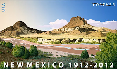
Here, I have enlarged the closest butte and pushed its head up through the clouds behind. This dramatically improves the perspective of the scene. It's really important because the foremost butte is lighter than the farther one. Colors are generally darker and more saturated the closer you are to them. I've shrunk the shrub at lower right to subordinate it to the buttes and prevent it from competing with the buttes scale-wise..
I don't want to take away anything from the artist. I love this image, and it could be that he represents the scene accurately. But, if the aim is to make a pleasing picture (using one's artistic license) then you should be conscious of these relationships in your work and actively seek to make better paintings by mitigating them. Otherwise, you might as well become a photographer.
Tuesday, March 27, 2012

The Wrong Side of the Tracks?

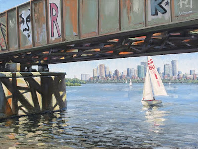
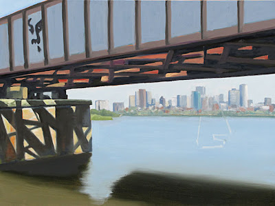
I've finished my painting of the railroad bridge over the Charles River in Boston (18"X24" on stretched linen) and I'm pretty happy with how it turned out. I was attempting to set up several themes and I think I succeeded:
1) Triangles in the landscape.
2) Ideas of ugliness and beauty.
3) Text in the landscape, both acceptable and, um, not-completely-acceptable.
4) Art imitating life imitating art, etc.
5) Hard vs soft areas in landscape (and strong contrasts).
The triangle theme is obvious. I'm attracted to strong geometries in the landscape. I always liked geometry in high school, so I guess my mind naturally keys in to that.
The ugliness/beauty theme is rather subjective. Street art is all the rage nowadays (at least with the critics). I like juxtaposing the rather cliché prettiness of sailboats with the edge-of-repectability in grafitti. To be fair, there was a lot more grafitti on the bridge than I included in the painting. The bridge already has a very strong personality, it didn't need any more.
The text in the landscape (bridge and sail) theme is obvious.
In the art imitating life... theme I chose to make art of a real-life scene that includes grafitti (the "Obey" face by Shepard Fairey, patially visible at left) that was created from another's photograph of a real living person (André the Giant). It feels a bit like looking into a mirror reflecting a mirror, then again, and again...
I made many little decisions in bringing this painting to finish from the last posting of it. I minimized the buildings on the left in the distance to keep them from contradicting the perspective of the image. I am still concerned with the 2 tree-covered peninsulas that are in that area. The bigger one is behind the smaller one — that is contrary to perspective, but I think I will live with it. I made sure that the more distant foliage is significantly cooler in color temp to push it back. I kept the sailboats soft (other than the large one) to add to the contrast with the iron-hard bridge. Next up, NOT a bridge!

Monday, March 5, 2012

What’s on My Easel

I’ve started a 16” x 20” canvas of my BU Bridge field study from last summer. What drew me to this view was how the airy, cool, and idyllic river with sailboats was framed by the hard, contrasty, warm tones of the rusting, grafitti-covered railroad bridge, and how the battle between the two played out in the reflections in the water. I gravitate to such contrasty images (you won’t find me doing too many fog paintings), but maybe they’re not to everyone’s taste.


I visited the location in Boston twice last year to get the palette recorded in my 8” x 10”study. I had a good deal of pruning to do of the trees and shrubs at the river’s edge to get even a semi-unobstructed view (don’t tell anybody it was me). I always pack a pair of loppers in my car for the occasional branch that’s in the way, but this area needed a lot of work! I don’t know what the people riding and running by thought I was doing, but at least one shouted, “Thank you.” I think she thought I was making it easier for bikers to see around the curve.

I took many reference photos of the water, the bridge, sailboats, grafitti from both sides, and the city in the distance. While I paint in my studio I display these on my computer as needed. The plan is to sift through my pics of grafitti and include a nice array of ones I think go together. This will set up a secondary juxtaposition in this painting: fine art (I hope) played against street art. I don’t think any of the street artists will sue me or anything, since they’d have to admit in court to breaking the law in placing their grafitto on the bridge in the first place, ha! Here is an interesting question: If I include a bit of Sheopard Fairey’s “OBEY” sticker that still shows on the bridge, can he sue me because he has paid his fines for doing it? Hmmm. I think it falls under the heading of “Fair use.”

Since the reflections in the water are dependent on the landscape I plan to do the water last (I have just roughed in the colors here). I started the bridge with a wash of cadmium orange so that the overall effect will be warm. You can see that I have lightly outlined where I am going to place the closest sailboat. This boat is going to appear dazzlingly bright compared the massively dark bridge, so this will be my focal point. I will include at least a few more distant boats to create depth in the scene.

I guess a third theme in this painting would be — triangles!

More top come!

Friday, February 24, 2012

What's in a Name?

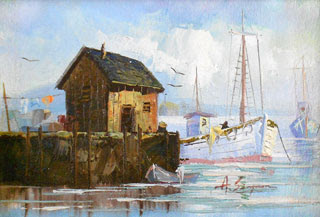
This painting is by “A. Simpson,” one of many artists who (I suspect) cranked out thousands of similar seascapes in the 50s and 60s (in Asia?) to feed the cheap art market in America. I hear that most of these works were signed with WASPy, made-up names to make them look more yankee to the public. I receive a few emails each year from people (who have come by one of A’s paintings in a yard sale) asking if I ever signed my work “A. Simpson.” This makes me consider a few different aspects of having an online presence as an artist.

Before the internet I felt bad for people who had odd names or names with weird spellings. Now that I have my art online I have to think about making it easy for people to find me. Do you have any idea how many images Google comes up with when you search on the word “Simpson?” Just 476 million! There are a lot of The Simpsons fans out there, then there are a lot of people who are interested in what Jessica is doing, and Ashley, and OJ, etc. As if that weren’t bad enough, there are a lot of people named Steven Simpson in the world, there are even quite a few fine artists and illustrators with that name, and some of them BETTER than me!!! This is why I started insisting that my middle initial be included when my name is used online, and why I started getting the “A. Simpson” inquiries. So, if you have a distinctive name — be glad! It’s going to make your online life a lot easier. As for “A. Simpson’s” work being confused with mine, at first I was offended. I dashed off a few cranky emails in response — “You’ve got to be kidding! Have they SEEN my work?” Then I started thinking, whatever drives people to my gallery site is a good thing, right? Actually, A’s paintings aren’t so bad. Sure, they are hasty and formulaic, but the one above has some nice things going on. It’s colorful and it fits a lot of waterfront icons into a reasonable design. So, thanks “A. Simpson.” You made me a *tiny* bit easier to find online. And, no, I never signed a painting that way. BTW, if you like “A’s” painting I’ve shown here, it’s available for purchase on Etsy for 23 bucks — here.

Wednesday, February 15, 2012

Sold a Painting!

I recently sold this painting. It shows the back side of Crane Beach and Hog Island in the Essex River watershed (MA). In a rather cool coincidence I did this painting “The Snowless Winter” some years ago when we were having a mild one. This year, when we are again having a record mild and snowless winter someone is touched by this image and scoops it up. I think it surprised both me and the gallery owner (winter is usually slow). You just never know how long it will take for the person who will identify something in your work that resonates with them to stand in front of your painting.

Saturday, February 11, 2012

New (small) Painting!

I just turned this 8"x10" field sketch into a finished painting. There's a small works show coming up at The Copley Society and I needed something, uh, small. Normally, I save my field sketches as reference for a larger painting, but I tried tinting this canvas panel orange (as I’ve seen some other artists do). Well, IT WAS A DISASTER! I ended up making the sketch WAY too warm as the orange blazed through my thinner strokes. It was not going to be help in referencing the scene for me. So, I took another pass at it using my photos as refs and I’m calling it a finished small painting. Maybe I'll wait ’til summer and paint the small ref again, THEN do the larger version?

Friday, February 3, 2012

News: I just heard that I’ve been juried into the Copley Society of Art in Boston. This is a great honor for me, not to mention a rather big deal for my career.

Really, I am much happier than I look in this picture at right. In my head I'm jumping up and down and waving my arms! > > > > > > > > > > > > > > > >

Wednesday, January 25, 2012

Rant: Resolution Confusion

I was never so happy as when the art world finally gave up its Luddite adherence to the rule that all images for art shows and galleries must be submitted on 35mm slides! They were not the last to join the digital revolution by a long shot (have you peeked into the records room at your doctor’s office?) but it made the lives of artists so much easier.

That said, all we have to do now is get art professionals to list correct submission guideline! Rare is the week that I don't email a show organizer to tell them that their guidelines for art image files are useless (though, I’m always much more diplomatic than that!) To be fair, describing this sort of thing in a way that a non-digitally-minded person can understand is difficult.

Here is the problem: The terms “dpi” (dots per inch), and “resolution” are meaningless as a guideline unless they are paired with a physical dimension in inches (or millimeters.) An image that is the size of a postage stamp can be 300dpi, and so can one that is the size of a bed sheet. What “dpi” means is simply, how many pixels would you count in one inch of an image if you slapped a ruler on top of it.

There are 2 solutions to these error-prone guidelines:
1) If you want to tell people a dots-per-inch measure (even my mother, who is in her 70s and a wonderful painter, has heard of dpi) you must also list a picture size. This is acceptable: “All images submitted must be 300dpi and approximately 4 inches by 6 inches in size.” See? You're telling people that if you make your image 4 inches in the short direction, and the resolution of your image is set to 300dpi, then you will be submitting an image that has 1200 pixels counted along the short dimension. 4 inches times 300 dots (pixels) per inch equals 1200 pixels.

2) I prefer to forget about “dpi” and “resolution” altogether. These terms are confusing. Tell artists that the longest dimension of their image(s) should be between 1000 and 1200 pixels, or between something and something. All they have to do is get their image to a pixel length that falls in that range and they’re golden.

That’s all the ranting I have time for today. I've got to submit some images to a show. Now, they say 300dpi. So, do they want a postage stamp or a laptop-screen-sized image? Hmmmmmmm. I’m going to guess...

Tuesday, January 24, 2012

Photographing Your Art: See Your Weatherman!


Photographing your art is one of the more challenging aspects of producing (and, it’s hoped, selling) your art. If you’re like me, you don’t have tons of money to throw at photographers to shoot your finished paintings. But, if you have some knowledge of cameras and lighting, you can do most of your photography for your fine art website or art-show submissions yourself.

You will find many differing opinions of how you should be photographing your work, and I’m here to tell you the correct way! Getting studio lighting right so that it won’t make hot spots or color casts that are way off is a problem that has dogged me (and myriad photographers). In the studio I have used a *fairly* sophisticated setup of 2 spotlights with diffusers and a digital SLR to get my shots, but this process is still fraught with often-unsatisfactory results. So, like most of the solutions to problems one encounters in art, I suggest you go back to nature. The standard for viewing art is under daylight. Daylight is basically sunlight, minus any color added by reflection or filtering.

Here is the quickest and simplest way to take photos of your art that are undistorted and mostly color-accurate:

1) Shoot you paintings outdoors on an easel with your camera on a tripod perpendicular to the painting’s surface. Make sure you line up your camera so that it is perpendicular to the center of your artwork’s surface plane. This will lessen distortion caused by perspective. If your camera has a zoom lens move your tripod back and zoom in. Fill the frame with your art. This will reduce edge distortion that is caused by the wide angle setting that most point-and-shoot cameras default to.

2) Do not photograph your work in direct sunlight — it is too warm and way too bright. Also, direct sunlight on your painting will yield a much-too-warm image.

3) Do not shoot in the shade on a sunny day either — the light you are recording is reflected/filtered by the sky and will make your images much too blue.

4) The best source of clean diffuse daylight is the sky on a BRIGHT, but OVERCAST day. The light will be subdued, so, not too harsh. The clouds will neutralize much of the blue cast of a clear sky. These days are not super-rare. Save up your painting photography and keep your eyes open for these weather conditions. If you don't believe me, wait for one of these days, go outside, and look at items in the landscape whose local color is white, gray, or black (houses painted flat white, gray rocks, black or gray asphalt. You will see that any color cast that sunlight or blue sky might produce to your eye, is suddenly gone. That is what you want. You want the camera to read the paint on your painting.

For me, photographing my art is never fun, but it can be kept fairly simple, leaving me time to do what I want to be doing — painting!